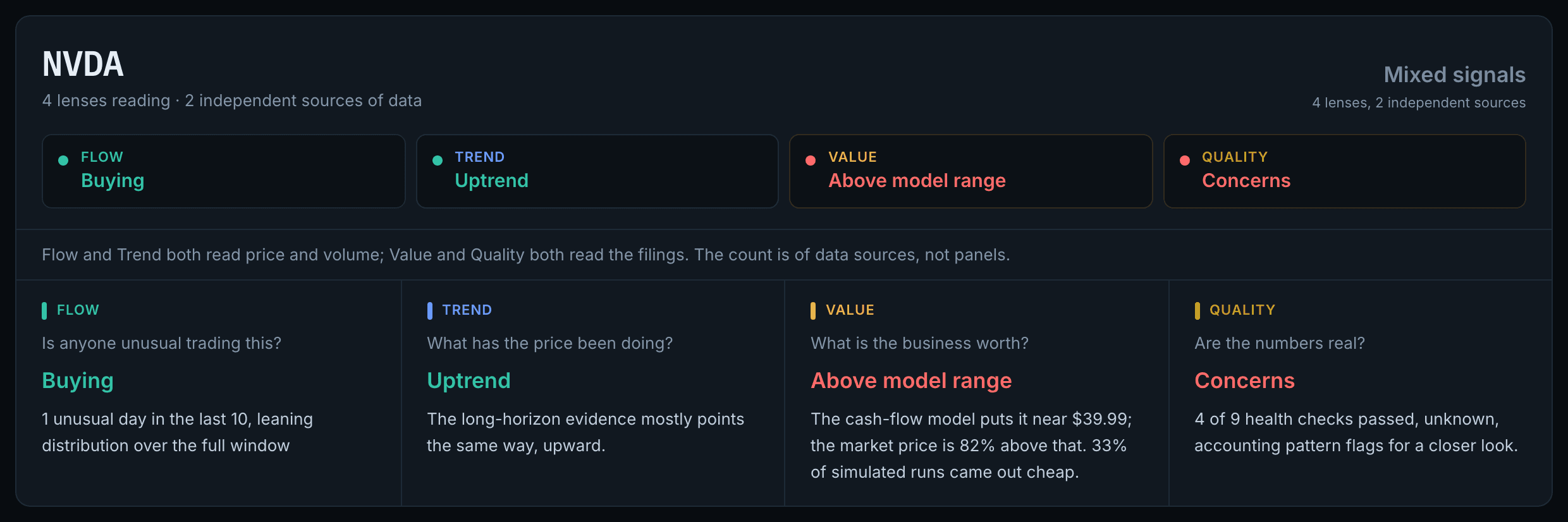
Fig. 1QuantDesk reading NVDA, verdict “Mixed signals”: Flow says Buying and Trend says Uptrend, while Value reports the price 82% above the cash-flow model and Quality flags 4 of 9 health checks passed. A line beneath notes that Flow and Trend both read price and volume while Value and Quality both read the filings — so the count is of data sources, not panels.
A quantitative equity research desk that runs four models reading four different datasets — order flow, price trend, intrinsic value and accounting quality — then reports where they agree, where they contradict each other, and what none of them can see. Covers US and Indonesian (IDX) listings.
IThe problem
Most retail research tools give you one opinion and a number. That is the failure mode, not the feature: any single model can be fooled. A stock looks cheap on a spreadsheet while quietly bleeding cash; it looks strong on a chart because one fund happened to rebalance that week.
The interesting signal is not any one model's verdict — it is agreement between models that share no inputs. So QuantDesk runs four that read genuinely different data and puts their answers in a row, including when they contradict each other.
IIHow it works
Flow — is anyone unusual trading this?
An Isolation Forest reads six behavioural features per trading day — return, relative volume, absolute return, Money Flow Index, an on-balance-volume z-score, and intraday range. Days that don't look like other days get flagged, labelled Accumulation or Distribution by a four-way vote of money-flow indicators, and scored 0–100.
Alongside it runs a CUSUM change detector, which exists to catch what the first model structurally cannot. An institution building a position splits its order across weeks precisely so that no single day stands out — a per-day outlier detector can only ever catch the impatient buyer. CUSUM accumulates small deviations instead, so a long run of unremarkable days trips a threshold none of them would alone. On AAPL it surfaced a 27-day accumulation running at 1.04× average volume: invisible to any volume-spike rule.
Trend — what is the price doing, and could I have held it?
Five sections behind a horizon selector, ordered longest-first so reading left to right walks from the strongest evidence to the weakest. The long horizon leads with a checklist — 200-day average, Faber's 10-month rule, 12-1 momentum, ADX, Hurst exponent, trend-line fit, 52-week position, drawdown survivability — each line stating which way it points and why.
Then the table that actually matters: every overlapping holding period in the history, so "worst 3-year window" replaces a headline CAGR that only describes one lucky start date. Then what holding it cost — maximum drawdown with depth, duration and recovery, plus the Ulcer index, which correctly scores a long shallow grind as worse than a sharp fall, because that is how it feels to hold.
Setups are pre-registered and checked in order, and "none of them is present" is the most common answer. A test fires the detector across twenty random walks and fails the build if a majority produce a trade. Candlestick patterns are detected, graded weak, and firewalled — none is permitted to place an entry, stop or target.
Value — what is the business actually worth?
Three models routed automatically by sector: discounted cash flow for most companies, a dividend discount model for banks and insurers, and residual income for financials with no usable dividend data. Each runs a five-year projection plus terminal value, then a 10,000-draw Monte Carlo to produce a range rather than a single number.
The panel also solves the model backwards: what growth rate would make today's price correct? On AAPL that came out at 37% a year for five years against a 10% assumption — a claim about the world you can agree or disagree with, rather than a "fair value" a reader has no basis to judge. It is stated as conditional on the other inputs, because across plausible discount rates the same price implies anywhere from 24% to 42%.
Quality — are the numbers real?
Three published accounting screens computed from filings the app has already fetched: the Piotroski F-Score for fundamental trend, the Altman Z''-score for distance from distress, and the Beneish M-Score for accruals resembling companies later found to have manipulated earnings. The Altman variant is the emerging-market one, so an IDX listing and a US one land on the same scale.
Scan, rank, and the honesty of a composite
The breadth half of the workflow batch-downloads up to 250 symbols in a handful of upstream calls and scores each on seven price-and-volume signals. Every signal becomes a cross-sectional percentile before anything is combined, because "top decile of this scan" is a claim the data supports and "82/100" is not.
The panel then does what composite scores usually hide: it reports the measured rank correlation between every pair of signals and the participation ratio of that matrix — how many genuinely independent signals the composite is really averaging. On a real Dow scan, momentum and trend correlate at +0.98 and seven columns carry about 3.2 signals' worth of independent information. That number is printed in the panel header rather than buried.
Measuring the claim the app makes loudest
In the largest type on the page, on every run, the confluence rail asserted that the four lenses rest on two independent bodies of data — and therefore that when the two agree, the agreement is not one fact counted twice. Nothing had ever measured it. Both the rail and the explainer admitted as much, and gave the same excuse: the ranking panel can measure its own overlap because a scan gives it a cross-section, and a single ticker does not. That is true of a request and false of a script.
The statistic is Cohen's kappa — observed agreement minus the agreement each lens's own habits already supply. Raw agreement is uninterpretable here for the same reason a raw screener hit count is: a lens calling 70% of companies cheap and one calling 70% sound land on the same label 58% of the time while sharing nothing at all. Kendall's tau-b runs alongside it, because kappa asks whether two lenses reach the same label and tau-b whether they order the same way. Intervals are bootstrapped over names rather than taken from a closed form that conditions on marginals which are themselves estimates.
It ran on all 168 deduplicated names of the four index universes, each pushed through the production payload builders — the same API calls the ticker bar actually sends, so the number describes this app rather than a lookalike. A lens that could not read does not vote: a bank's refused accounting screens recorded as neutral would manufacture agreement with every other lens that happened to be quiet.
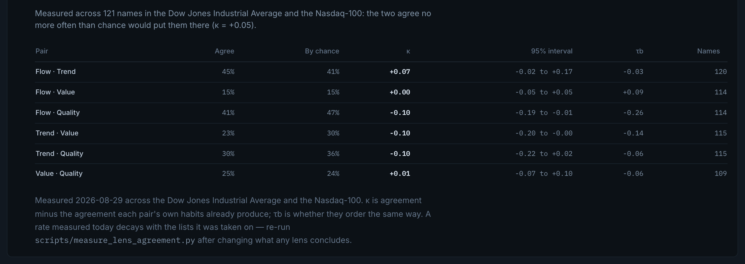
The claim survived. The panel now reports it in place: measured across 121 names in the Dow Jones Industrial Average and the Nasdaq-100, the price family and the filings family agree no more often than chance would put them there, κ = +0.05. Across all four index universes — 168 deduplicated names — the figure is +0.03. So agreement between them really is two facts rather than one counted twice.
What ships is the whole table, not the headline: every pair of lenses with its raw agreement rate, the rate chance alone would produce, κ, a bootstrapped 95% interval, τb and the number of names behind it. Three of the six pairs come out slightly negative. It is stamped with the date it was measured and names the script to re-run, because a rate like this decays with the lists it was taken on.
The finding nobody was looking for
Flow and Trend — the pair deliberately collapsed into a single vote because they read the same price-and-volume series — came out at κ = +0.07, on an interval running from −0.02 to +0.17 that straddles zero. From the other end, the participation ratio says the four lenses carry 3.72 lenses' worth of independent information, not the two they are counted as.
The grouping was left alone anyway, and that is the part worth keeping. A kappa near zero cannot distinguish a reading that carries separate information from one that is mostly noise — both are uncorrelated with everything. The Flow lens's own event study returns no significant effect on most tickers. A lens that is independent because it is uninformative has not earned a vote of its own, so the conservative collapse stands and the panel explains why rather than quietly claiming credit for the extra independence.
IIIDecisions
Prose summary instead of a buy/hold/sell score
Above the tabs, a plain-English summary reports what the lenses agree on, names where they disagree, states what it cannot tell you about this particular company, and lists what to check next. It is deliberately prose and not a number: collapsing four disagreeing models into one score discards every finding the rest of the app works to establish.
Every figure explains itself
Each number carries an info affordance that says what it measures in plain English, whether this value is good or bad and why, and what would make you act differently — or admits that nothing would. A Guided/Full toggle defaults to Guided, folding expert tuning controls behind one labelled disclosure so the interface is legible to someone who has never read a DCF.
Indicators grouped by the horizon they speak to
A long-term investor shown "Stochastic 82, overbought" next to "price is above its 200-day average" has been handed two statements of very different weight, presented identically. Grouping by horizon is a small change that removes a real category error.
IVWhat it can’t do
Each of these is stated in the product itself, not only here.
Limitation
The independence claim is measured, but narrowly
The headline claim now rests on a measurement rather than an assertion, and it held: κ = +0.03 between the price family and the filings family. But that is one statistic, on 168 names, in one snapshot. A kappa near zero says two lenses do not agree more than chance — it does not say either of them is informative, which is exactly why the Flow and Trend result was left as a caution rather than used to justify splitting their vote.
Limitation
Flow cannot identify who traded
Index rebalances, options expiry, dividend dates and earnings all produce identical footprints to institutional accumulation. The panel estimates the bid-ask spread and warns when a move is small enough to be swallowed by trading costs — on a thin stock, "heavy volume moved the price" often just means the order book is shallow.
Limitation
A DCF is an opinion with arithmetic attached
The answer moves enormously with the growth and discount rates you assume, which is why the output is a P5–P95 range and every assumption is an editable field. The panel warns when terminal value dominates — often 60–80% of a DCF — because that means the answer rests on a perpetuity guess rather than on the forecast.
Limitation
Quality refuses to score banks
None of the three accounting screens was built on financial firms: there is no operating cycle for "working capital" to describe, and revenue is not a receivables-and-inventory process. Financials get an explicit refusal instead of a misleading number. Beneish is also a screen, not a finding — it catches roughly three-quarters of manipulators, which on a population where manipulation is rare means most flags are false alarms.
Next
ScholarTrack